By SCOTT MCKIE B.P.
One Feather Asst. Editor
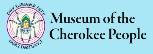
CHEROKEE, N.C. – The Museum of the Cherokee Indian has changed its name and branding and is looking to further expand its mission of educating people. Announced officially on Tuesday, Oct. 3 during the Cherokee Indian Fair Parade, the new name of the facility will be the Museum of the Cherokee People – but, there’s more to it than that.
The name for the Museum in the Cherokee syllabary is now: ᏣᎳᎩ ᎢᏗᏴᏫᏯᎯ ᎢᎦᏤᎵ ᎤᏪᏘ ᎠᏍᏆᏂᎪᏙᏗ (Tsalagi idiyvwiyahi igatseli uweti asquanigododi) which roughly translates into the English language as “All of us are Cherokee people. It is all of ours, where the old things are stored”.
 Shana Bushyhead Condill, Museum executive director, said, “The points that we gave to the Speaker’s Council was that we wanted a word that we would call ourselves. That was really important. We wanted to think about the Museum as ours. That, as Cherokee people, that this Museum is our Museum – that we’re not just a tourist destination, but that we are of the community and we serve the community.”
On the change from Museum of the Cherokee Indian to Museum of the Cherokee People, Condill noted, “For us, the English isn’t as exciting. The Cherokee is really impactful. But, what it ends up being is instead of ‘Museum of the Cherokee Indian’, it’s ‘Museum of the Cherokee People’.”
“That shift sounds like a small one, I would say. But, it really shapes everything that we’re doing and exemplifies our mission, image, and values that we worked really hard on, and where we want to go in the future…we want to be really intentional about how we portray ourselves to the world, as well. We have a responsibility to our community.”
Dakota Brown, Museum director of education, said, “I think one of the most important things, and one of the biggest things that will affect me in my work, and my team, is that we feel pretty strongly here that we tell the story of a people – that we’re not just a history museum, that we’re not a natural history museum, that we don’t fit and define ourselves win a particular category like most other museums do. We do tell the story of Cherokee people. So, the name exemplifies that and uplifts that, and, this is the story of us as people. For me, it’s really exciting because the stories that we can tell…people and humans are so complex all throughout history. There’s no really clear right or wrong, nor black and white look at history because history is made by humans, and humans are imperfect. So, to understand that, that’s what the name exemplifies, for me. As we think about interpretation, and if we think about this new exhibit, being able to tell those complex stories of who we are as a people, is so exciting and important.”
Michael Slee, Museum director of operations, noted, “There’s buy-in from the community in a lot of places already that represents a lot of demographics from the Tribe as well. I would say our Board is a good mix of elders as well as young leaders. Our staff is mostly young leaders. I would just say, as a parent, it’s really important for me to be able to talk to my kids about how the place that I work represents Cherokee people. They know Cherokee people. They don’t know Cherokee Indians, they know Cherokee people. I think my kids will feel represented by that. They see themselves in that name more than they’ll ever see themselves in ‘Cherokee Indians’.”
With the name change comes a change in logo and branding which was designed by Tyra Maney, Museum graphic designer, who said of her work, “It was a more modernized version of the water spider. Our current logo is an exact replica of the shell engraved carving of the water spider. I took elements of that and made it more symmetrical. Then I added design elements to it. I wanted us to be a world-class museum, and I wanted this name change, re-brand, and new direction to reflect that.”
Maney saw a bandolier bag in Atlanta that had a mountain peak design that she added to the water spider design. “Bandoliers traditionally were symbols of status and held important items within reach.”
She added, “In the center of the spider, you traditionally see the cross design in the middle. That’s the fire that the spider carried. I changed that to a different pottery design to where it looks like it’s in motion and that reflects the constant evolution of who we are as Cherokee people and how our culture will shift and evolve as we go on through generations. The design on the back of the water spider is a mountain peak design, but I did it in three sections. So, it represents, basically, how we move through the world and through the three worlds. We have the underworld, the middle world where we are, and then the sky world. It’s basically how we live and move through those worlds, and how you can’t have one world without the other worlds. There’s that constant harmony.”
Maney went on to discuss the color palette of the design and branding that had one goal in mind. “I want people to rethink what they imagine when they see earth tones.”
“The new branding colors are all based on our homelands here. So, the blue is our primary color and it’s based on the blue that you see when you look out at the mountain range and the Smoky Mountains. The green is based off the evergreen trees that we have here. The magenta color that we have is based on the flower colors from rhododendron trees. The yellow is from touch-me-not flowers. And then the black is an off-black and it’s based on blackberries which we have here and we use all the time. Then the off-white is based on the flowers of locust trees. Those are things that I think of when I think of earth tones. It’s a big pet peeve for me when people use beige and muddy greens and browns and colors like that for earth tones, especially in this area.”
Condill loves the new looks. “When we walked through the slides of what she (Tyra) had done, I was blown away. The idea of holding things close, that protection. That is important to us. That is one of our guiding principles here at the Museum. And, innovation is. Everything that she put in her design corresponded so well with how we work here, and what’s important to us, and how we make decisions.”
“We don’t have to rely on Southwest themes. For so long, I think Native design has relied pretty heavily on that. They’re lovely and appropriate for those tribes. But, for us in the Southeast, we have a beautiful palette, let’s celebrate it.”
Brown said change is a part of being Cherokee and a part of moving forward. “We’ve always changed, we’ve always been innovative. At one point, the things being done in the 70’s for the Museum were really innovative and were really impactful for our community and kind of a big deal. So, I just feel that we’re building on that legacy of those that came before us, and those that built this museum, and those that made this museum what it is today. Without that innovation, we wouldn’t be where we are today. And I think we would be doing a disservice to all those that came before us if we didn’t continue to be innovative, we didn’t continue to move our museum forward. My hope is that our community will be able to understand and appreciate that, that we want to continue to move forward and continue to be innovative, not only for museums, but for our community.”